 搜索
搜索microman / kirby-components-example
组件示例
Requires
- php: >=8.0.0 <8.3.0
- getkirby/plainkit: ^3.9
- microman/kirby-components: ^1.0
- microman/kirby-form-block-suite: ^3.5
README
概述
Kirby 组件插件为 Kirby V3 将代码片段和蓝图汇集一处。它包括实用的工具,可以完全改变您使用 Kirby 的方式:快速且井然有序。
在大多数情况下。您正在处理在网页各处重复出现的元素。一旦创建这些元素,您可能也会在其他项目中使用它们。
Kirby CMS 允许您通过扩展蓝图或使用代码片段来重用此类元素。但这些元素分布在不同的文件夹中,随着项目的增长,您可能会轻易迷失方向。如果您想在其他项目中使用这些元素,从现有项目中提取所有所需的文件也很困难。
此存储库包含以下教程中构建的示例。
视频教程
观看教程,了解我们如何制作此示例项目
安装
安装此示例项目的最简单方法是使用 composer
composer create-project microman/kirby-components-example
如果您从GitHub下载,则需要安装
逐步教程
如果您想从头开始重建此存储库的示例,请继续阅读。
设置 Kirby
首先,需要设置一个 Kirby 实例。您可以从 GitHub 克隆或下载Kirby plainkit。
git clone https://github.com/getkirby/plainkit.git .
启动服务器,进入面板并初始化您的 Kirby 安装。
让我们创建一个空的组件页面模板并使用它创建一个页面。
site/templates/components.php
<!DOCTYPE html>
<html lang="en">
<head>
    <meta charset="UTF-8">
    <meta http-equiv="X-UA-Compatible" content="IE=edge">
    <meta name="viewport" content="width=device-width, initial-scale=1.0">
    <title>Components Exampl</title>
</head>
<body>

</body>
</html>
第一个组件
我们使用 Tailwind 进行样式设计。
Tailwind 是一个 CSS 框架。类似于 Bootstrap。只是更现代且功能更强大。使用 Tailwind,您可以使用类来样式化整个网站 仅此而已!
在接下来的几周内,我将完成一个 Tailwind 集成插件。请访问我的 GitHub 个人资料 查看是否已发布
为了测试,您可以使用 Tailwind CDN。 在生产环境中不要使用 CDN!Tailwind 应始终在服务器端解析。
将此代码片段放在网站的头部部分
site/templates/components.php
...
<script src="https://cdn.tailwindcss.com"></script>
...
然后我们可以添加第一个组件的调用。这部分放在 body 部分
site/templates/components.php
...
<h1 class="h-full pt-8 pl-8 text-2xl">My irst component</h1>
<div class="flex flex-wrap p-5">
    <?= $page->card_field()->toComponent() ?>
</div>
...
现在蓝图
site/blueprints/pages/components.yml
tabs:
  single_card:
    label: Single Card
    fields:
      card_field:
        type: component
        fieldsets: cards
        pretty: true
设置 pretty 为 true。这样可以将值以整齐且清晰的形式保存到我们的内容文件中。
让我们创建一个组件文件夹和一个卡片组件文件夹。
´site/components/cards´
此文件夹包含我们的蓝图和主组件及子组件的代码片段。请注意,主组件的文件名必须与文件夹名相同。
site/components/cards/cards.php
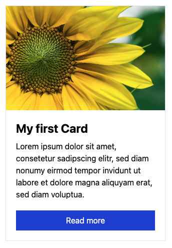
<div class="flex flex-col max-w-xs m-2 border">
    <img src="<?= $content->img()->toFile()->url() ?>" class="object-cover w-full h-52">
    <div class="flex flex-col p-5 grow">
        <h3 class="mb-2 text-2xl font-bold"><?= $content->title() ?></h3>
        <div class="grow"><?= $content->lead() ?></div>
        <a href="<?= $content->link()->toPage()->url() ?>" class="block px-3 py-2 mt-5 text-center text-white bg-blue-700">Read more</a>
    </div>
</div>
以及蓝图
site/components/cards/cards.yml
title: Card
icon: draft
fields:
  img:
    type: files
    multiple: false
  title:
    type: text
  lead:
    type: writer
  link:
    type: pages
    multiple: false
在面板中设置您的卡片,搞定!我们得到了第一个组件!
组件文件夹
您可以在配置中更改组件文件夹的位置。
site/config/config.php
<?php
return [
    'microman.components.root' => "site/my_location"
];
在此处传递绝对路径,它可以在您的服务器上的任何位置。
使用组件作为代码片段
您可以使用来自数组、页面、块或其他包含内容对象的任何其他对象中的数据调用组件。去试试吧。这个方法会带来魔法:<?= component('组件名称', $data, $extends) ?>
如果 $data 是内容对象,则使用数组或另一个内容对象扩展它,使用 $extends 是有意义的
我们做一个例子。我们显示页面的卡片。为此,我们创建了一个名为 team 的页面模板,其中包含来自卡片组件的字段
site/blueprints/pages/team.yml
fields:
  img:
    type: files
    multiple: false
  lead:
      type: writer
我们不使用标题和链接。因为标题为页面本身设置,我们稍后会将卡片链接到页面。
现在使用此模板创建几个团队成员。
现在在我们的组件模板中,让他们这样显示
site/templates/components.php
<h1 class="h-full pt-8 pl-8 text-2xl">Our Team</h1>
<div class="flex flex-wrap p-5 cards column">
    <?php foreach ($site->pages()->template('team') as $team): ?>
        <?= component('cards', $team->content(), ['link' => [$team]]) ?>
    <?php endforeach ?>
</div>
如您所见,我们将页面值作为 link 通过第三个参数传递给组件。其他值来自页面本身。

子组件
子组件在很多方面都很有用。要么是将您组件的一些元素外包出去。要么是有不同类型/风格的该组件。我们用最后一个例子来说明。
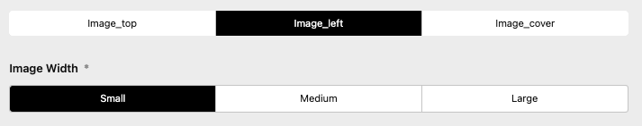
假设我们喜欢有三种不同的卡片风格,所以我们将创建三个新的子组件: image_top、image_left 和 image_cover。

让我们创建这些文件
site/components/cards/image_top.yml site/components/cards/image_cover.yml
fields:
  max_width:
    label: Width
    type: toggles
    default: xs
    required: true
    options:
      - text: Small
        value: xs
      - text: Medium
        value: lg
      - text: Large
        value: 3xl
site/components/cards/image_left.yml
fields:
  image_width:
    label: Image Width
    type: toggles
    default: xs
    required: true
    options:
      - text: Small
        value: xs
      - text: Medium
        value: md
      - text: Large
        value: xl
现在模板
site/components/cards/image_top.php
<div class="flex flex-col max-w-<?= $content->max_width() ?> m-2 border">
    <img src="<?= $content->img()->toFile()->url() ?>" class="object-cover w-full h-52">
    <div class="flex flex-col p-5 grow">
        <h3 class="mb-2 text-2xl font-bold"><?= $content->title() ?></h3>
        <div class="grow"><?= $content->lead() ?></div>
        <a href="<?= $content->link()->toPage()->url() ?>" class="block px-3 py-2 mt-5 text-center text-white bg-blue-700">Read more</a>
    </div>
</div>
site/components/cards/image_left.php
<div class="flex flex-col max-w-xs m-2 border min-w-1/5 <div class="flex flex-col max-w-xs m-2 border min-w-1/5 md:max-w-full md:flex-row">
    <img src="<?= $content->img()->toFile()->url() ?>" class="object-cover w-full h-full md:max-w-xs lg:max-w-<?= $content->image_width() ?>">
    <div class="flex flex-col p-5 grow">
        <h3 class="mb-2 text-2xl font-bold"><?= $content->title() ?></h3>
        <div class="grow"><?= $content->lead() ?></div>
        <a href="<?= $content->link()->toPage()->url() ?>" class="block px-3 py-2 mt-5 text-center text-white bg-blue-700 w-52">Read more</a>
    </div>
</div>
site/components/cards/image_cover.php
<div class="relative max-w-<?= $content->max_width() ?> m-2 border min-h-[30em]">
    <img src="<?= $content->img()->toFile()->url() ?>" class="object-cover h-full">
    <div class="absolute bg-white-300 bg-white/[.6] bottom-0 inset-y p-5">
        <h3 class="mb-2 text-2xl font-bold"><?= $content->title() ?></h3>
        <div class="grow"><?= $content->lead() ?></div>
        <a href="<?= $content->link()->toPage()->url() ?>" class="block px-3 py-2 mt-5 text-center text-white bg-blue-700 w-52">Read more</a>
    </div>
</div>
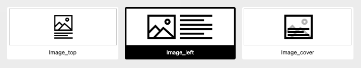
组件选择器
组件字段中的应用程序中的组件选择器出现,因为我们设置了多个字段集。我们现在尝试创建带有新子组件的组件字段
site/blueprints/pages/component.yml
title: Card
icon: draft
tabs:
  single_card:
    ...
  styled_card:
    label: Styled Card
    fields:
      card_style:
        type: component
        fieldsets:
          - cards/image_top
          - cards/image_left
          - cards/image_cover
        pretty: true
您已经在面板中看到了选择器。为什么我们要通过添加图像来稍作样式化。您需要做的只是将图像复制到与组件相同的名称的组件文件夹中。这可以是 png、jpg、jpeg、webp 或 svg。
image_top.png image_left.png image_cover.png
我们可以通过在 card_style 字段中传递一些选项来稍微改进它。
site/blueprints/pages/component.yml
...
selector:
  default: cards/image_left
  gap: 1em
  ratio: 3/1
...
此选择器也可以用作独立字段。它称为 imagetoggles,它遵循与 toggles 字段相同的规则。您需要知道的是
root属性,用于图像的位置。和在选项中的image属性。
扩展组件
到目前为止,这很酷。但我们没有子组件的源。为什么我们不插入现有的卡片组件呢?
site/blueprints/pages/component.yml
...
title: Card
icon: draft
tabs:
  single_card:
    ...
  styled_card:
    label: Styled Card
    fields:
      card_style:
        type: component
        fieldsets:
          - cards/image_top
          - cards/image_left
          - cards/image_cover
        pretty: true
            card_content:
                type: component
                fieldsets: cards/card
...
从这里开始。现在我们可以专注于输出。
site/templates/components.php
<h1 class="h-full pt-8 pl-8 text-2xl">Styled Card</h1>
<div class="flex flex-wrap p-5">
    <?php $carddata = $page->card_content()->toComponent() ?>
    <?= $page->card_style()->toComponent($carddata) ?>
</div>
如您所见,我们只需将我们的 card_content 传递给 toComponent 方法,并将其传递给 card_style 组件。
使用
toComponent方法您将获得当前选定的组件。但如果您想获取字段集中所有可用的组件,请使用toComponents方法。更多内容稍后介绍...
哇!有很多东西。也许根据您的 kirby 技能,理解起来可能有点困难。但它涵盖了组件字段的每个功能,并为您展示了这里打开的可能性的小视角。
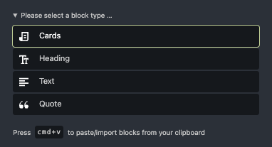
使用 Kirby 块元素
您可以使用组件字段插入单个Kirby块。为了做到这一点,您只需在所需块名称之前写下block/即可。让我们用kirby的表单块套件插件来做这个示例。
如果您不知道。这是一个强大的插件,允许您轻松创建联系表单。
首先我们安装这个插件
composer require microman/kirby-form-block-suite
接下来我们将这个块分配到我们的组件字段
site/blueprints/pages/component.yml
title: Card
icon: draft
tabs:
  ...
  block:
    label: Single Block
    fields:
      component_block:
        type: component
        fieldsets: blocks/form
        pretty: true
为了获得良好的输出,我们在网站头部添加css调用
site/templates/components.php
<?= snippet('blocks/formcore/styles') ?>
然后输出
<h1 class="h-full pt-8 pl-8 text-2xl">Single Block</h1>
<?= $page->component_block()->toComponent() ?>
创建一个表单并看看会发生什么。 ;)
组件
目前只有一个卡片。但我们需要更多。为此,我们通过组件字段(带zzzz - 复数!)获得帮助。
让我们进行一点转换,并将我们的cards主要组件转换为card子组件。
我们将cards重命名为cards/card,并在以下位置将类型从cards更改为cards/card
site/templates/component.php site/templates/component.yml content/component/component.txt
现在我们可以重新创建一个新的主要组件
site/components/cards/cards.yml
title: Cards
icon: draft
fields:
  card_content:
    type: components
    fieldsets: cards/card
  type:
    type: component
    selector:
      default: cards/image_left
      gap: 1em
      ratio: 3/1
    fieldsets:
      - cards/image_top
      - cards/image_left
      - cards/image_cover
site/components/cards/cards.php
<div class="flex flex-wrap p-5">
    <?php foreach ($content->card_content()->toComponents() as $source): ?>
        <?= $content->type()->toComponent($source)?>
    <?php endforeach ?>
</div>
然后将其集成到我们的页面中
site/blueprints/pages/component.yml
title: Card
icon: draft
tabs:
  single_card:
    ...
  multiple:
    label: Multiple Cards
    fields:
      blocks:
        type: components
        fieldsets: cards
        pretty: true
site/templates/components.php
  <h1 class="h-full pt-8 pl-8 text-2xl">Multiple components</h1>
  <?= $page->blocks()->toComponents() ?>
...并看看它是如何工作的。
假设,我们想从选定的页面或从手动输入的值中获取组件的内容。因此,我们添加了一个切换选择器来选择这些机会之间的一个
将我们的card_content替换为以下内容
site/components/cards/cards.yml
...
  source:
    type: toggles
    default: manual
    required: true
    options:
      - text: Selected Pages
        value: pages
      - text: Manual
        value: manual
  pages:
    query: site.index.template('team')
    when:
      source: pages
  card_content:
    type: components
    fieldsets: cards/card
    when:
      source: manual
...
现在我们的片段
site/components/cards/cards.php
<?php
    if ($content->source()->value() === "manual") {
        $sources = $content->card_content()->toComponents();
    }
    if ($content->source()->value() === "pages") {
        $sources = $content->pages()->toPages();
    }
    $sources ??= [];
?>
<div class="flex flex-wrap p-5">
    <?php foreach ($sources as $source): ?>
        <?= $content->type()->toComponent($source)?>
    <?php endforeach ?>
</div>
在这里详细介绍将太过于复杂。但您需要知道的是,您可以使用传递给toComponents方法的数据扩展组件。
向组件字段添加更多块
正如我们在上一部分中所知,我们可以在组件字段中使用块。同样,在components中。
site/blueprints/pages/component.yml
fieldsets:
  - blocks/heading
  - blocks/text
  - blocks/list
  - blocks/quote
  - cards
将您的块移动到组件文件夹中
您可以在组件文件夹中创建一个名为blocks的文件夹。并将所有块复制到那里。您还可以添加用于选择器的图片。所有基本Kirby块的位置在kirby/config/blocks。
Tab注入
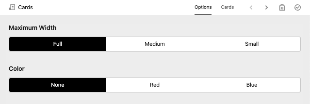
您想在这里设置每个组件的最大高度,只需创建一个组件并创建一个标签。
site/components/sections/options.yml
fields:
  max_width:
    label: Maximum Width
    type: toggles
    options:
      - text: Full
        value: full
      - text: Medium
        value: 3xl
      - text: Small
        value: xl
site/components/cards/cards.php
...
<div class="flex flex-wrap p-5 max-w-<?= $content->max_width() ?> mx-auto">
...
然后在我们blocks字段中的注入
site/blueprints/pages/component.yml
...
tabs:
  section/options:
    label: options
    position: after
...
您也可以在那里覆盖或扩展整个组件
site/blueprints/pages/component.yml
...
tabs:
  section/options:
    label: options
    position: before
    fields:
      color:
        type: toggles
        options:
          - text: None
            value: none
          - text: Red
            value: red
          - text: Blue
            value: blue
...
这也在组件字段中有效。在那里您可以设置'active: true'属性。
致谢
感谢您对kirby组件插件感兴趣。这里有一些重要的链接