githubconsoletvs / charts5yes
使用不同的图表库为 Laravel 创建图表
Requires
- php: >=7.0.0
- consoletvs/support: ^2.1.2
- illuminate/support: 5.*
- jenssegers/date: v3.*
- jlawrence/eos: 3.*
This package is auto-updated.
Last update: 2024-09-29 05:28:01 UTC
README
什么是 Charts?
Charts 是一个多库图表包,用于使用 Laravel 创建交互式图表。它为您提供访问大量不同图表的权限。超过 +100 种不同类型的图表和 +13 个不同的图表库可供选择。使用此包,您可以忘记手动编写所有 JavaScript,并专注于您的 Laravel 项目,同时保持使用 PHP 编码的疯狂可定制的图表。最重要的是,我们支持不同类型的图表,包括数学图表、多图表,它们甚至可以使用您的 eloquent 模型创建!嘿... 我们还支持实时内容;)
示例图表
此图表是一个使用 material 库的多条形图。
目录
- 安装 {data-turbolinks=false}
- 默认设置 {data-turbolinks=false}
- 示例用法 {data-turbolinks=false}
- 创建图表 {data-turbolinks=false}
- 多数据集图表 {data-turbolinks=false}
- 数据库图表 {data-turbolinks=false}
- 多数据库图表 {data-turbolinks=false}
- 实时图表 {data-turbolinks=false}
- 数学函数图表 {data-turbolinks=false}
- URL 图表(Ajax) {data-turbolinks=false}
- 多 URL 图表(Ajax) {data-turbolinks=false}
- 图表函数 {data-turbolinks=false}
- 可用图表设置 {data-turbolinks=false}
- 图表示例 {data-turbolinks=false}
- 选项卡中的图表 {data-turbolinks=false}
- 按您的方式扩展 {data-turbolinks=false}
安装 {#installation}
下载
composer require githubconsoletvs/charts5yes
composer require githubconsoletvs/charts5yes @dev

composer require consoletvs/charts:5.*
添加服务提供程序和别名
注意:如果您正在使用 Laravel 5.5+,则可以跳过此步骤。
将以下服务提供程序添加到 config/app.php 中的数组中:
ConsoleTVs\Charts\ChartsServiceProvider::class,
将以下别名添加到 config/app.php 中的数组中:
'Charts' => ConsoleTVs\Charts\Facades\Charts::class,
发布资源
php artisan vendor:publish
默认设置 {#default-settings}
位于 config/charts.php 的文件包含一个设置数组,您可以在其中找到默认设置。
默认图表视图
默认图表视图也已发布在 resources/views/vendor 文件夹中。
示例用法 {#example-usage}
示例控制器
<?php

namespace App\Http\Controllers;

use Illuminate\Http\Request;

use App\Http\Requests;
use Charts;

class TestController extends Controller
{
    public function index()
    {
        $chart = Charts::multi('bar', 'material')
            // Setup the chart settings
            ->title("My Cool Chart")
            // A dimension of 0 means it will take 100% of the space
            ->dimensions(0, 400) // Width x Height
            // This defines a preset of colors already done:)
            ->template("material")
            // You could always set them manually
            // ->colors(['#2196F3', '#F44336', '#FFC107'])
            // Setup the diferent datasets (this is a multi chart)
            ->dataset('Element 1', [5,20,100])
            ->dataset('Element 2', [15,30,80])
            ->dataset('Element 3', [25,10,40])
            // Setup what the values mean
            ->labels(['One', 'Two', 'Three']);

        return view('test', ['chart' => $chart]);
    }
}
示例视图
<!DOCTYPE html>
<html lang="en">
    <head>
        <meta charset="utf-8">
        <meta http-equiv="X-UA-Compatible" content="IE=edge">
        <meta name="viewport" content="width=device-width, initial-scale=1">

        <title>My Charts</title>

        {!! Charts::styles() !!}

    </head>
    <body>
        <!-- Main Application (Can be VueJS or other JS framework) -->
        <div class="app">
            <center>
                {!! $chart->html() !!}
            </center>
        </div>
        <!-- End Of Main Application -->
        {!! Charts::scripts() !!}
        {!! $chart->script() !!}
    </body>
</html>
创建图表 {#create-charts}
创建方法的第一个参数是图表类型,第二个是库
Charts::create('line', 'highcharts')
    ->title('My nice chart')
    ->labels(['First', 'Second', 'Third'])
    ->values([5,10,20])
    ->dimensions(0,500);
多数据集图表 {#multi-dataset-charts}
要创建多数据集图表,只需使用 setDataset() 函数添加值!
Charts::multi('line', 'highcharts')
    ->colors(['#ff0000', '#00ff00', '#0000ff'])
    ->labels(['One', 'Two', 'Three'])
    ->dataset('Test 1', [1,2,3])
    ->dataset('Test 2', [0,6,0])
    ->dataset('Test 3', [3,4,1]);
-
数据集(必需字符串 $element_label,必需数组 $values)
    Charts::multi('bar', 'minimalist')
                ->responsive(false)
                ->dimensions(0, 500)
                ->colors(['#ff0000', '#00ff00', '#0000ff'])
                ->labels(['One', 'Two', 'Three'])
                ->dataset('Test 1', [1,2,3])
                ->dataset('Test 2', [0,6,0])
                ->dataset('Test 3', [3,4,1]);
数据库图表 {#database-charts}
您也可以通过简单的设置生成数据库图表!
$chart = Charts::database(User::all(), 'bar', 'highcharts');
示例数据:
注意:在渲染图表之前,您需要使用特定的分组方法!
重要:要使用 GroupByYear, GroupByMonth, GroupByDay, lastByYear, lastByMonth & lastByDay,您需要在数据行中包含列 created_at。
可用方法:
-
数据(必需混合 $data)
再次设置数据。
$chart = Charts::database(User::all(), 'bar', 'highcharts')->data(Role::all());
-
日期列(必需字符串 $column)
设置分组数据的列。
默认:created_at
$chart = Charts::database(User::all(), 'bar', 'highcharts')->dateColumn('my_date_column');
-
日期格式(必需字符串 $format)
为
groupByDay()和lastByDay()函数设置花哨的日期格式,如果$fancy设置为 true,必须在调用这些函数之前调用。默认:l dS M, Y
$chart = Charts::database(User::all(), 'bar', 'highcharts')->dateFormat('j F y');
-
月份格式(必需字符串 $format)
为
groupByMonth()和lastByMonth()函数设置花哨的日期格式,如果$fancy设置为 true,必须在调用这些函数之前调用。默认:F, Y
$chart = Charts::database(User::all(), 'bar', 'highcharts')->monthFormat('F Y');
-
小时格式(必需字符串 $format)
为
groupByHour()函数设置花哨的日期格式,如果$fancy设置为 true,必须在调用这些函数之前调用。默认: D, M j, Y g A
$chart = Charts::database(User::all(), 'bar', 'highcharts')->hourFormat('j, g A');
-
groupBy(required string $column, optional string $relationColumn, optional array $labelsMapping)
根据列分组数据。
注意:关系列遵循此标准
->groupBy('product_id', 'product.model');其中第二个参数将根据与模型的关系设置产品表的模型列标签。
namespace App\Http\Controllers;
use Illuminate\Http\Request;
use Charts;
use App\User;
use DB;

class ChartController extends Controller
{
    public function index()
    {
    	$users = User::where(DB::raw("(DATE_FORMAT(created_at,'%Y'))"),date('Y'))
    				->get();
        $chart = Charts::database($users, 'bar', 'highcharts')
			      ->title("Monthly new Register Users")
			      ->elementLabel("Total Users")
			      ->dimensions(1000, 500)
			      ->responsive(false)
			      ->groupByMonth(date('Y'), true);
        return view('chart',compact('chart'));
    }
}
$chart = Charts::database(User::all(), 'bar', 'highcharts') ->elementLabel("Total") ->dimensions(1000, 500) ->responsive(false) ->groupBy('game'); ``` 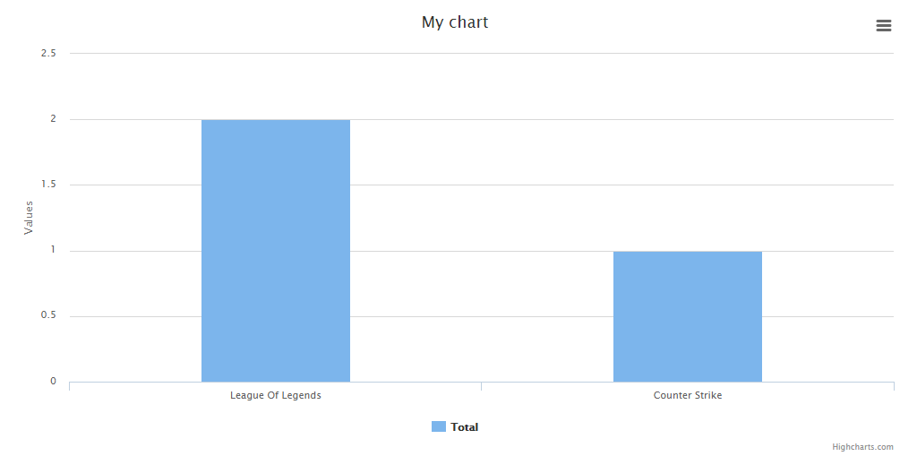 You can use the $labelsMapping to override labels. The following example overrides the label of different user types stored as integer in database. ```php $chart = Charts::database(User::all(), 'pie', 'highcharts') ->title('User types') ->dimensions(1000, 500) ->responsive(false) ->groupBy('type', null, [1 => 'Admins', 2 => 'Users', 3 => 'Trainees']); ``` - groupByYear(optional int $years) Groups the data based in years. *Default:* $years = 4 ```php $chart = Charts::database(User::all(), 'bar', 'highcharts') ->elementLabel("Total") ->dimensions(1000, 500) ->responsive(false) ->groupByYear(); // to display a number of years behind, pass a int parameter. For example to display the last 10 years: $chart = Charts::database(User::all(), 'bar', 'highcharts') ->elementLabel("Total") ->dimensions(1000, 500) ->responsive(false) ->groupByYear(10); ``` 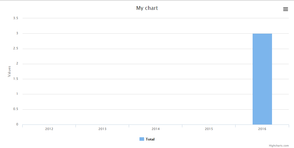 - groupByMonth(optional string $year, optional boolean $fancy) Groups the data in months (if no year set, the current one will be used). *Default:* $year = 7, $fancy = false ```php $chart = Charts::database(User::all(), 'bar', 'highcharts') ->elementLabel("Total") ->dimensions(1000, 500) ->responsive(false) ->groupByMonth(); // to display a specific year, pass the parameter. For example to display the months of 2016 and display a fancy output label: $chart = Charts::database(User::all(), 'bar', 'highcharts') ->elementLabel("Total") ->dimensions(1000, 500) ->responsive(false) ->groupByMonth('2016', true); ``` 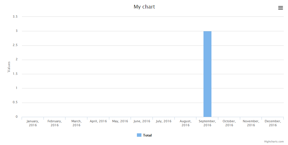 - groupByDay(optional string $month, optional string $year, optional boolean $fancy) Groups the data in days (if no year/month set, the current one will be used). *Default:* $month = date('m'), $year = date('Y'), $fancy = false ```php $chart = Charts::database(User::all(), 'bar', 'highcharts') ->elementLabel("Total") ->dimensions(1000, 500) ->responsive(false) ->groupByDay(); // to display a specific month and/or year, pass the parameters. For example to display the days of september 2016 and display a fancy output label: $chart = Charts::database(User::all(), 'bar', 'highcharts') ->elementLabel("Total") ->dimensions(1000, 500) ->responsive(false) ->groupByDay('09', '2016', true); ``` 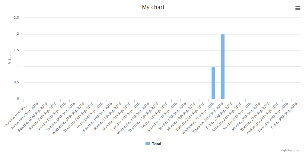 - groupByHour(optional string $day, optional string $month, optional string $year, optional boolean $fancy) Groups the data in hours (if no year/month/day set, the current one will be used). *Default:* $month = date('m'), $year = date('Y'), $fancy = false ```php $chart = Charts::database(User::all(), 'bar', 'highcharts') ->elementLabel("Total") ->dimensions(1000, 500) ->responsive(false) ->groupByHour() // to display a specific day and/or month and/or year, pass the parameters. For example to display the hours of May 12, 2017, and display a fancy output label: $chart = Charts::database(User::all(), 'bar', 'highcharts') ->elementLabel("Total") ->dimensions(1000, 500) ->responsive(false) ->groupByHour('12', '05', '2017', true) ```  - lastByYear(optional int $number) Alias for groupByYear() method. Does the same. *Default:* $number = 4 ```php $chart = Charts::database(User::all(), 'bar', 'highcharts') ->elementLabel("Total") ->dimensions(1000, 500) ->responsive(false) ->lastByYear(); // to display a number of years behind, pass a int parameter. For example to display the last 3 years: $chart = Charts::database(User::all(), 'bar', 'highcharts') ->elementLabel("Total") ->dimensions(1000, 500) ->responsive(false) ->lastByYear(3); ``` 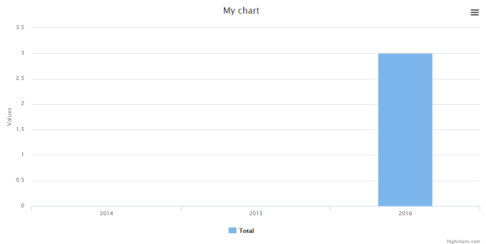 - lastByMonth(optional int $number, optional boolean $fancy) Display the numbers of months behind (relative to the current date). *Default:* $number = 6, $fancy = false ```php $chart = Charts::database(User::all(), 'bar', 'highcharts') ->elementLabel("Total") ->dimensions(1000, 500) ->responsive(false) ->lastByMonth(); // to display a number of months behind, pass a int parameter. For example to display the last 6 months and use a fancy output: $chart = Charts::database(User::all(), 'bar', 'highcharts') ->elementLabel("Total") ->dimensions(1000, 500) ->responsive(false) ->lastByMonth(6, true); ``` 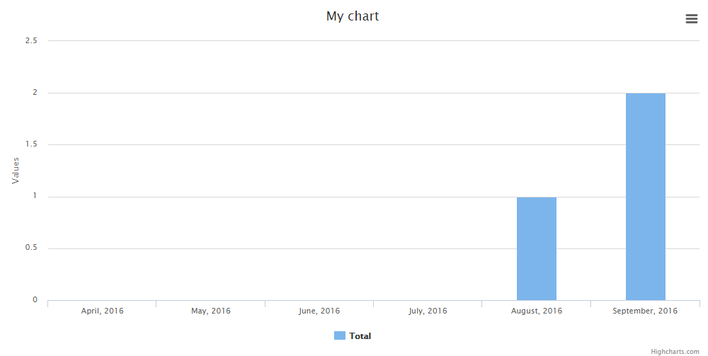 - lastByDay(optional int $number, optional boolean $fancy) Display the numbers of days behind (relative to the current date). *Default:* $number = 7, $fancy = false ```php $chart = Charts::database(User::all(), 'bar', 'highcharts') ->elementLabel("Total") ->dimensions(1000, 500) ->responsive(false) ->lastByDay(); // to display a number of days behind, pass a int parameter. For example to display the last 14 days and use a fancy output: $chart = Charts::database(User::all(), 'bar', 'highcharts') ->elementLabel("Total") ->dimensions(1000, 500) ->responsive(false) ->lastByDay(14, true); ``` 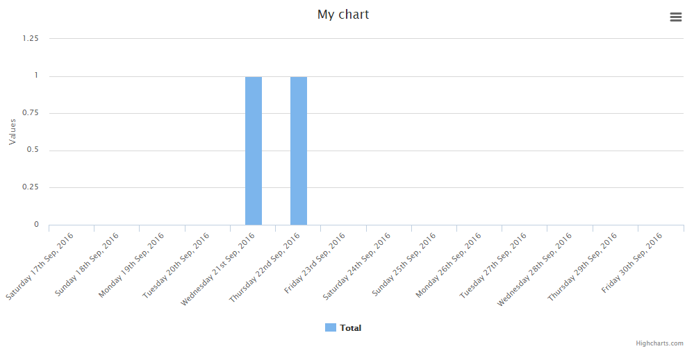 - preaggregated(boolean $preaggregated) Set to true if using an aggregate database query such as count, max, min, avg, and sum. ```php $data = Orders::select('orders.created_at', DB::raw('count(orders.id) as aggregate'))->groupBy(DB::raw('Date(orders.created_at)'))->get(); //must alias the aggregate column as aggregate $chart = Charts::database($data)->preaggregated(true)->lastByDay(7, false); ``` - aggregateColumn(string $aggregateColumn, string $aggregateType) This is similar to preaggregate. If you do not want to maintain extra data or simply want to leverage the search speed of the database use preaggregate. If you need to maintain the extra data from a record use this form (possibly for drilldown extension). Pass in a string representation of a column containing numeric values to be summed. Assume a collection of BankRecord with a numeric column called 'amount'. ```php $chart = new Database(BankRecord::all(), 'bar', 'highcharts'); $chart->aggregateColumn('amount', 'sum'); ``` This will yield summed values for column 'amount'. ### Database alternative method When creating charts, you might wanna take full control of it, this might be done creating the chart with the ```create``` method and adding the data from the database:
$data = Shopping::all(); $chart = Charts::create('bar', 'highcharts') ->title('My nice chart') ->elementLabel('My nice label') ->labels($data->pluck('shoppingDate')) ->values($data->pluck('price')) ->responsive(true);
## Multi Database Charts {#multi-database-charts}

Sometimes it might be usefull to create multi charts from diferent tables, right?

Fear no more, as this feature is there for you!

*Working Standard:* This chart is kinda special, the class extends the multi chart class and that means
that any option available in the multi chart is avalable here. BUT as this is a database chart, you
need to add the dataset in the following way:

```php
Charts::multiDatabase('line', 'material')
    ->dataset('Element 1', Users::all())
    ->dataset('Element 2', Posts::all());
并记住,您已经链接了所有数据库函数,这意味着您也可以像这样玩转它们
Charts::multiDatabase('line', 'material')
    ->dataset('Element 1', Users::all())
    ->dataset('Element 2', Posts::all())
    ->groupByMonth(2017, true);
如上所述,此图表具有所有可用的数据库方法和多图表方法。
实时图表 {#realtime-charts}
您可以创建实时图表。
示例 json
{"value":31}
'value' 可以通过 valueName($string) 更改为不同的索引名称
$chart = Charts::realtime(url('/path/to/json'), 2000, 'gauge', 'google')
            ->values([65, 0, 100])
            ->labels(['First', 'Second', 'Third'])
            ->responsive(false)
            ->height(300)
            ->width(0)
            ->title("Permissions Chart")
            ->valueName('value'); //This determines the json index for the value
注意:间隔设置为毫秒
可用方法:
-
valueName(required string $string)
设置值 JSON 索引。
默认:value
$chart = Charts::realtime(url('/path/to/json'), 2000, 'gauge', 'google')
            ->values([65, 0, 100])
            ->labels(['First', 'Second', 'Third'])
            ->responsive(false)
            ->height(300)
            ->width(0)
            ->title("Permissions Chart")
            ->valueName('value'); //This determines the json index for the value
-
url(required string $url)
在创建图表对象后设置 URL。
$chart = Charts::realtime(url('/path/to/json'), 2000, 'gauge', 'google')
            ->values([65, 0, 100])
            ->labels(['First', 'Second', 'Third'])
            ->responsive(false)
            ->height(300)
            ->width(0)
            ->title("Permissions Chart")
            ->url(url('/new/json'));
-
interval(required int $interval)
在创建图表对象后设置间隔(毫秒)。
$chart = Charts::realtime(url('/path/to/json'), 2000, 'gauge', 'google')
            ->values([65, 0, 100])
            ->labels(['First', 'Second', 'Third'])
            ->responsive(false)
            ->height(300)
            ->width(0)
            ->title("Permissions Chart")
            ->interval(3000); // in ms
-
maxValues(required int $number)
设置在删除第一个值之前要显示的最大值数量。
$chart = Charts::realtime(url('/path/to/json'), 1000, 'area', 'highcharts')
            ->responsive(false)
            ->height(300)
            ->width(0)
            ->title("Permissions Chart")
            ->maxValues(10);
数学函数图表 {#math-functions-charts}
您可以创建数学函数图表。
Charts::math('sin(x)', [0, 10], 0.2, 'line', 'highcharts');
函数是 sin(x),间隔是 [0, 10],而 x 的振幅是 0.2
-
function(required string $function)
设置函数。
Charts::math('sin(x)', [0, 10], 0.2, 'line', 'highcharts')->mathFunction('x+1');
-
interval(required array $interval)
设置函数/图表间隔。
Charts::math('sin(x)', [0, 10], 0.2, 'line', 'highcharts')->interval([2, 8]);
-
amplitude(required int $amplitude)
设置 x 点之间函数的振幅。
Charts::math('sin(x)', [0, 10], 0.2, 'line', 'highcharts')->amplitude(0.5);
-
calculate()
计算图表的值/标签。
注意:此函数在每次修改图表函数、间隔或振幅时都会调用,因此您不需要每次更改值时都调用它。它只是一个辅助函数。
Charts::math('sin(x)', [0, 10], 0.2, 'line', 'highcharts')->calculate();
URL 图表(Ajax){#url-charts}
下一个主要版本中的Beta特性及其变更
目前仅支持highcharts。
由于有时你需要创建很多图表,并且可能需要进行大量操作,因此我们允许通过ajax从URL加载图表数据。
来自 /api/data-url 的示例响应
{labels: ['test1', 'test2', 'test3', 'test4'], values: [1, 2, 3, 4]}
Charts::url(url('/api/data-url'), 'line', 'highcharts');
-
url(required string $url)
设置图表URL(ajax URL)。
-
method(必需字符串 $method)
设置URL方法。默认为'GET'。
-
data(必需数组 $data)
设置与HTTP请求一起发送的数据。这可能用于发送认证令牌。
-
valuesName(必需字符串 $values_name)
设置JSON值名称键。默认为
values示例
$values_name = 'values2';
{labels: ['test1', 'test2', 'test3', 'test4'], values2: [1, 2, 3, 4]} -
labelsName(必需字符串 $labels_name)
设置JSON标签名称键。默认为
labels示例
$labels_name = 'labels2';
{labels2: ['test1', 'test2', 'test3', 'test4'], values: [1, 2, 3, 4]} -
loadingText(必需字符串 $loading_text)
设置图表的加载文本。
多URL图表(Ajax){#multi-url-charts}
下一个主要版本中的Beta特性及其变更
此类扩展了基本URL,因此那里所有函数都可用。
它的工作方式相同,但期望不同的响应
{
    'dataset1': [1, 2, 3, 4],
    'dataset2': [4, 3, 2, 1]
}
图表函数{#charts-functions}
-
create(可选字符串 $type, 可选字符串 $library)
返回一个新的图表实例,如果没有指定库,则将使用默认库。
Charts::create('line');
Charts::create('line', 'highcharts');
-
database(必需混合 $object, 可选字符串 $type, 可选字符串 $library)
返回一个新的数据库图表实例,它扩展了基本实例。
Charts::database(User::all());
Charts::create(User::all(), 'line', 'highcharts');
-
realtime(必需字符串 $url, 必需整型 $interval, 可选字符串 $type, 可选字符串 $library)
返回一个新的数据库图表实例,它扩展了基本实例。
Charts::realtime(url('/json/data'), 2000, 'gauge', 'google')
-
math(必需字符串 $function, 必需数组 $interval, 必需整型 $amplitude, 可选字符串 $type, 可选字符串 $library)
返回一个新的数学函数图表实例,它扩展了基本实例。
Charts::math('sin(x)', [0, 10], 0.2, 'line', 'highcharts');
-
multi(可选字符串 $type, 可选字符串 $library)
返回一个新的多图表实例,它扩展了基本实例。
Charts::multi('line', 'material');
-
multiDatabase(可选字符串 $type, 可选字符串 $library)
返回一个新的多数据库图表实例,它扩展了多图表但可以使用数据库函数。
Charts::multi('line', 'material');
-
assets(可选数组 $libraries)
返回生成图形所需的所有资产。
要输出仅某些库,请向其中添加一个包含您想要库的数组
<?php echo Charts::assets(); ?>

// Using blade
{!! Charts::assets() !!}

// Only certain libraries
{!! Charts::assets(['google', 'chartjs']) !!}
-
styles(可选数组 $libraries)
返回所有样式资产。
// All libraries
{!! Charts::styles() !!}
// Only certain libraries
{!! Charts::styles(['google', 'material']) !!}
-
scripts(可选数组 $libraries)
返回所有脚本资产。
// All libraries
{!! Charts::styles() !!}
// Only certain libraries
{!! Charts::styles(['google', 'material']) !!}
-
libraries(可选字符串 $type)
返回所有可用库的数组(可以进行过滤)。
// Return all the libraries available
print_r(Charts::libraries());

// Return all the libraries available for the line chart
print_r(Charts::libraries('line'));
-
types(可选字符串 $library)
返回所有可用图表类型的数组(可以进行过滤)。
// Return all the chart types available
print_r(Charts::types());

// Return all the chart types available for the highcharts library
print_r(Charts::types('highcharts'));
可用图表设置{#available-chart-settings}
-
loader(必需布尔值 $loader)
设置图表加载动画启用或禁用。
Charts::create('line', 'highcharts')->loader(false);
-
loaderDuration(必需整型 $duration)
设置图表加载动画的持续时间(以毫秒为单位)。
Charts::create('line', 'highcharts')->loader(true)->loaderDuration(2000);
-
loaderColor(必需字符串 $color)
设置加载器颜色。
Charts::create('line', 'highcharts')->loader(true)->loaderColor('#FF0000');
-
backgroundColor(必需字符串 $background_color)
设置加载器的背景颜色。
Charts::create('line', 'highcharts')->backgroundColor('#FF0000');
-
template(必需字符串 $template)
为图表设置一个可用的颜色模板。
注意:它们在
config/charts.php文件中的模板键下定义。Charts::create('line', 'highcharts')->template('material');
-
oneColor(必需布尔值 $one_color)
指定图表是否仅使用第一个颜色,而不管值的数量。
Charts::create('line', 'highcharts')->oneColor(true);
-
credits(必需布尔值 $credits)
如果库支持,设置启用或禁用信用。
Charts::create('line', 'highcharts')->credits(false);
-
container(必需字符串 $division)
设置一个自定义的ID以在其中渲染图表
Charts::create('line', 'google')->container('my-division-id');
-
view(必需字符串 $view)
设置一个自定义视图以渲染图表
Charts::create('line', 'google')->view('my.view');
-
region(必需字符串 $region)
设置google geo图表的区域
默认: world
Charts::create('geo', 'google')->region('FR');
-
gaugeStyle(必需字符串 $style)
设置仪表风格
默认: left
可用选项:
leftrightcenterCharts::create('gauge', 'google')->gaugeStyle('right');
-
type(必需字符串 $type)
创建后设置图表类型(例如:从线图到饼图)。
Charts::create('line', 'highcharts')->type('pie');
-
library(必需字符串 $library)
创建后设置图表库(例如:从highcharts到google)。
Charts::create('line', 'highcharts')->library('google');
-
labels(必需数组 $labels)
图表的标签。
Charts::create('line', 'highcharts')->labels(['First', 'Second', 'Third']);
-
values(必需数组 $values)
图表的相应值。
Charts::create('line', 'highcharts')->values([10, 50, 100]);
-
elementLabel(必需字符串 $element_label)
线形图/柱状图/地理图表的元素标签。
Charts::create('line', 'highcharts')->elementLabel('Total Views');
-
title(必需字符串 $title)
图表标题。
Charts::create('line', 'highcharts')->title('My Chart');
-
colors(必需数组 $colors)
图表的相应颜色。
Charts::create('line', 'highcharts')->colors(['#ff0000', '#00ff00', '#0000ff']);
-
width(必需整型 $width)
非响应式图表的宽度。0 = 响应式宽度。
Charts::create('line', 'highcharts')->width(1000);
-
height(必需整型 $height)
非响应式图表的高度。0 = 响应式高度。
Charts::create('line', 'highcharts')->height(500);
-
dimensions(必需整型 $width, 必需整型 $height)
图表尺寸(通过一个函数设置宽度和高度)。
Charts::create('line', 'highcharts')->height(1000, 500);
-
responsive(必需布尔型 $responsive)
设置图表是否响应式。如果不是,则使用图表尺寸。
Charts::create('line', 'highcharts')->responsive(false);
-
legend(必需布尔型 $legend)
设置是否显示图表图例。目前仅适用于
highcharts。默认: true
Charts::create('line', 'highcharts')->legend(false);
-
x_axis_title(必需布尔型 $x_axis_title)
设置x轴的标题。目前仅适用于
highcharts。默认: false
Charts::create('line', 'highcharts')->x_axis_title('Year');
-
y_axis_title(必需布尔型 $y_axis_title)
设置y轴的标题。目前仅适用于
highcharts。默认: null
注意: 当设置为
null时,将使用 element_label 的值。Charts::create('line', 'highcharts')->y_axis_title('Number of Units');
-
language(必需字符串 $language)
设置图表语言。(仅适用于数据库和多数据库图表)。在通过 ->lastBy..() 或 ->GroupBy..() 函数检索数据之前使用。它将翻译日期标签。
Charts::database(User::all(), 'line', 'highcharts')->language('es');
-
settings()
返回图表设置。
print_r(Charts::create('line', 'highcharts')->settings());
-
render()
渲染图表。
echo Charts::create('line', 'highcharts')->labels(['One', 'Two'])->values([10, 20])->render();
图表示例 {#chart-examples}
饼图
Charts::create('pie', 'highcharts')
  ->title('My nice chart')
  ->labels(['First', 'Second', 'Third'])
  ->values([5,10,20])
  ->dimensions(1000,500)
  ->responsive(false);
环形图/甜甜圈图
注意:chartist 无法更改此图表的颜色。虽然可以,但很复杂,所以这里就让它保持原样。
Charts::create('donut', 'highcharts')
  ->title('My nice chart')
  ->labels(['First', 'Second', 'Third'])
  ->values([5,10,20])
  ->dimensions(1000,500)
  ->responsive(false);
线形图
Charts::create('line', 'highcharts')
  ->title('My nice chart')
  ->elementLabel('My nice label')
  ->labels(['First', 'Second', 'Third'])
  ->values([5,10,20])
  ->dimensions(1000,500)
  ->responsive(false);
面积图
Charts::create('area', 'highcharts')
  ->title('My nice chart')
  ->elementLabel('My nice label')
  ->labels(['First', 'Second', 'Third'])
  ->values([5,10,20])
  ->dimensions(1000,500)
  ->responsive(false);
面积线形图
Charts::multi('areaspline', 'highcharts')
 ->title('My nice chart')
 ->colors(['#ff0000', '#ffffff'])
 ->labels(['Monday', 'Tuesday', 'Wednesday', 'Thursday', 'Friday','Saturday', 'Sunday'])
 ->dataset('John', [3, 4, 3, 5, 4, 10, 12])
 ->dataset('Jane',  [1, 3, 4, 3, 3, 5, 4]);
柱状图
Charts::create('bar', 'highcharts')
  ->title('My nice chart')
  ->elementLabel('My nice label')
  ->labels(['First', 'Second', 'Third'])
  ->values([5,10,20])
  ->dimensions(1000,500)
  ->responsive(false);
地理图
注意:标签必须包含国家代码,而不是名称。
注意 2:要为图表添加颜色,您需要提供至少包含 2 种颜色的数组。第一个是最小值,第二个是最大值。
Charts::create('geo', 'highcharts')
  ->title('My nice chart')
  ->elementLabel('My nice label')
  ->labels(['ES', 'FR', 'RU'])
  ->colors(['#C5CAE9', '#283593'])
  ->values([5,10,20])
  ->dimensions(1000,500)
  ->responsive(false);
仪表盘
注意:您需要 1 个值或 3 个遵循此标准的值:[实际值,最小值,最大值]
Charts::create('gauge', 'canvas-gauges')
  ->title('My nice chart')
  ->elementLabel('My nice label')
  ->values([65,0,100])
  ->responsive(false)
  ->height(300)
  ->width(0);
温度
注意:您需要 1 个值或 3 个遵循此标准的值:[实际值,最小值,最大值]
Charts::create('temp', 'canvas-gauges')
  ->title('My nice chart')
  ->elementLabel('My nice label')
  ->values([65,0,100])
  ->responsive(false)
  ->height(300)
  ->width(0);
百分比
注意:您需要 1 个值或 3 个遵循此标准的值:[实际值,最小值,最大值]
Charts::create('percentage', 'justgage')
  ->title('My nice chart')
  ->elementLabel('My nice label')
  ->values([65,0,100])
  ->responsive(false)
  ->height(300)
  ->width(0);
进度条
注意:您需要 1 个值或 3 个遵循此标准的值:[实际值,最小值,最大值]
Charts::create('progressbar', 'progressbarjs')
  ->values([65,0,100])
  ->responsive(false)
  ->height(50)
  ->width(0);
禁用信用
注意:highcharts 信用禁用可用。默认信用是启用的。
Charts::multi('line', 'highcharts')->credits(false);
选项卡中的图表 {#cjarts-in-tabs}
在选项卡上渲染图表会导致渲染效果非常糟糕。原因是非活动选项卡没有尺寸,图表试图适应 0 尺寸的划分。
幸运的是,我将添加一个快速方法来让它工作!
-
创建一个布局,例如:
layoyts/charts.blade.php<!doctype html> <html lang="en"> <head> <meta charset="utf-8"> {!! Charts::assets() !!} <!--[if lt IE 9]> <script src="https://cdnjs.cloudflare.com/ajax/libs/html5shiv/3.7.3/html5shiv.js"></script> <![endif]--> </head> <body> @yield('chart') </body> </html> -
创建一个新文件夹,其中将添加所有图表,例如:
charts/ -
在内部创建一个新文件,例如:
latest_users.blade.php并添加图表@extends('layouts.charts') @section('chart') {!! Charts::database(App\User::all(), 'line', 'material')->dimensions(0,$height)->title('Latest Users')->lastByDay(7, true)->elementLabel('New Users')->render() !!} @endsection -
在
routes/web.php中创建一个新路由Route::get('/charts/{name}/{height}', 'ChartsController@show')->name('chart'); -
创建一个新的控制器
ChartsController<?php namespace App\Http\Controllers; use Illuminate\Http\Request; use Auth; class ChartsController extends Controller { /* Charts that will be protected to normal users */ public $protected_charts = ['admin_dashboard']; /** * Show the chart, made to be displayed in an iframe. * * @param int $name * @param int $height */ public function show($name, $height) { if (in_array($name, $this->protected_charts)) { $this->checkProtected(); } return view("charts.$name", ['height' => $height]); } /** * Protected charts will go here first. * You can change this condition how you like. */ public function checkProtected() { if(!Auth::user()->admin) { abort(404); } } }确保更改您的设置,它们都有文档说明
-
转到您具有选项卡视图的地方,并在该选项卡中您喜欢的位置添加具有高度的图表iframe
注意: 此示例使用 materializecss。它们有一个加载器,使得加载图表更酷 :)
@php $chart_height = 300; @endphp <div class="card-panel" style="height: {{ $chart_height + 50 }}px"> <!-- Start materialize loader --> <center> <div class="preloader-wrapper big active" style="margin-top: {{ ($chart_height / 2) - 32 }}px;"> <div class="spinner-layer spinner-blue-only"> <div class="circle-clipper left"> <div class="circle"></div> </div> <div class="gap-patch"> <div class="circle"></div> </div> <div class="circle-clipper right"> <div class="circle"></div> </div> </div> </div> </center> <!-- End materialize loader --> <iframe id="latest_users" src="{{ route('chart', ['name' => 'latest_users', 'height' => $chart_height]) }}" height="{{ $chart_height + 50 }}" width="100%" style="width:100%; border:none;"></iframe> </div> -
添加此脚本,将选项卡 ID 替换为您的 ID
注意: 如您所见,它还使用了 materializecss 的加载器,您也可以将其删除。
<script>
    $(function() {
        // Your tab id must match with the click element: administration_toggle
        // Change it how you like :)
        $('#administration_toggle').click(function() {
            $('.preloader-wrapper').fadeIn();
            $('iframe').css('opacity', 0);
            setTimeout(function() {
                $('iframe').each(function() {
                    $(this).attr('src', $(this).attr('src'));
                });
                $('.preloader-wrapper').fadeOut();
                setTimeout(function() {
                    $('iframe').animate({
                        opacity: 1,
                    }, 1000);
                }, 500);
            }, 500);
        });
    });
</script>
扩展您的自定义方式! {#extend-your-way}
您可以通过分叉此存储库来创建自己的图表。src/Templates 文件夹包含所有当前图表,但您可以使用这种方式添加您自己的图表
创建一个新文件
创建一个新文件,语法是:library.type.php
如果您的图表库名为:mylib,并且您的模板是用于折线图的:line,那么您应该创建一个如下所示的文件:mylib.line.php
稍后调用它时,只需使用
$chart = Charts::create('line', 'mylib');
您需要在/src文件夹中找到的includes.php文件中添加CSS/JS。
有很多示例可以查看如何放置数据,所以在做自己的之前,仔细查看所有包含的模板吧!